


This aesthetic regime does not reside in the present. It is something from the past. Not even the recent past but a particular value system more than thirty years old.
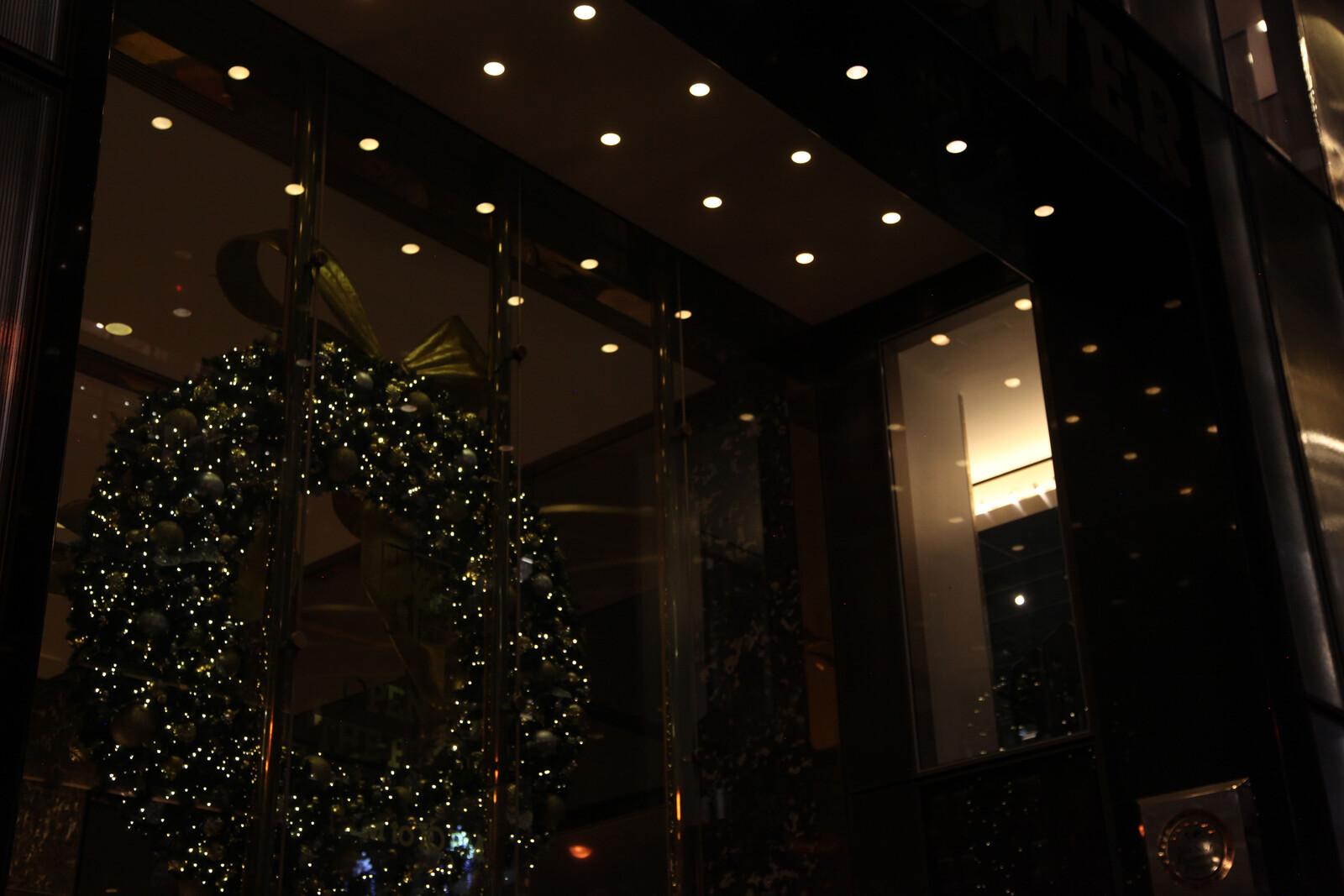
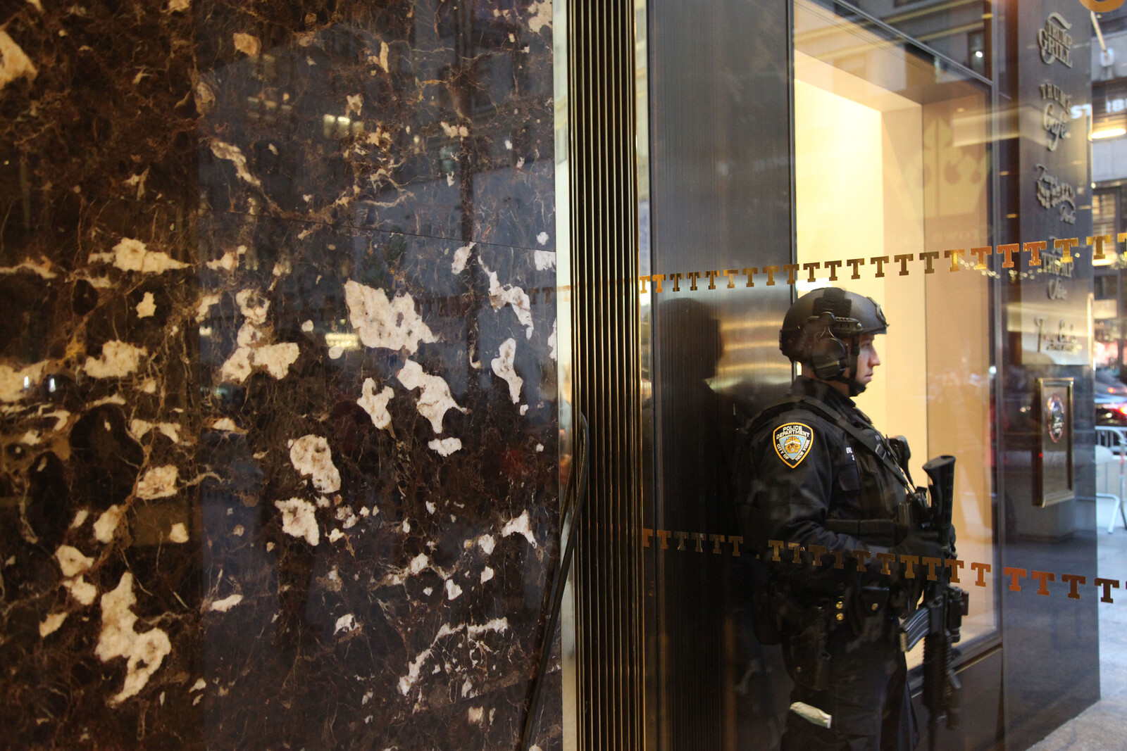
The entrance to a tall building on Fifth Avenue in New York is set back from the street approximately 9ft (274cm) from the inner edge of the sidewalk and forms a square arch that reaches up 24ft (731cm) high and is 18ft (548cm) wide. The entrance forms a shallow refuge from the movement of people walking past.
For the purposes of this precise description of a building we will not get beyond the front door—we will just consider the entrance. All measurements are approximate based on photos by the author and related to the estimated height of the doorman.
There are no steps up or down from the street and instead there is a continuation of the concrete sidewalk grade onto smooth dark flagstones each 18in (45cm) square. From this point a number of materials can be identified along with the dark stone on the ground. Glass, polished brass, polished black granite, and brushed stainless steel are the primary materials joined by various bronzed plaques and gilded lettering.

Such a combination takes us to a time where a jumbled realignment and surface-driven appropriation of high-modernist aesthetics within architecture were turning through a filter of postmodernist self-consciousness. This building is, in many ways, derivative of the earlier work of John Portman, real-estate developer and neofuturist architect famous for LA’s Westin Bonaventure Hotel and New York’s Marriot Marquis, who turned ninety-two on December 4, 2016.
To quote Fredric Jameson on Portman:
I am proposing the notion that we are here in the presence of something like a mutation in built space itself. My implication is that we ourselves, the human subjects who happen into this new space, have not kept pace with that evolution; there has been a mutation in the object unaccompanied as yet by any equivalent mutation in the subject. We do not yet possess the perceptual equipment to match this new hyperspace, as I will call it, in part because our perceptual habits were formed in that older kind of space I have called the space of high modernism. The newer architecture therefore—like many of the other cultural products I have evoked in the preceding remarks—stands as something like an imperative to grow new organs, to expand our sensorium and our body to some new, yet unimaginable, perhaps ultimately impossible, dimensions.1
The reason for this?
You are in this hyperspace up to your eyes and your body; and if it seemed before that the suppression of depth I spoke of in postmodern painting or literature would necessarily be difficult to achieve in architecture itself, perhaps this bewildering immersion may now serve as the formal equivalent in the new medium.2
Looking at the left elevation of the inset entrance arch and starting at the front edge where it meets the street, the following materials are deployed. First a 3ft (91cm) wide section of granite paneling that reaches from the ground to the soffit—carrying a number of information plaques, logos, and awards that are centered at a height of 5ft (152cm) from the ground.
There is a space for logos and awards here. The use of an arch as an inset cuts into the facade of an otherwise smooth frameless glazed tower. This reintroduces the codes of earlier triumphal elements that by their nature make space for crowing and self-awarding in a way that earlier disappearances of the entrance “proper” in utopian modernisms do not. Key elements indicate the takeover of a type of modernism by a form of minimalism. This was a key artistic development in the 1960s and creates a key misunderstanding. Minimalism is not a continuation of utopian modernism, it is a critique of utopian modernism on the basis of material facts and by way of a self-conscious play of real illusion against fake illusion. Minimalism is a development beyond modernist visions of totalizing utopia, one that breaks both from the everyday and from an illusionistic representation by attempting to include the human within a set of material encounters devoid of pretentions to completeness or truth of whatever kind.
Moving towards the entrance doorway, a second 3ft (91cm) wide section of cladding is formed of, in ascending order from the base: a 12in (30cm) section of polished granite; next, a 7ft (213cm) single-pane glass window; next, a 6ft (182cm) stainless-steel panel; and finally, an 8ft (243cm) single-pane glass window with a 2in (5cm) base sill to direct water away from the stainless-steel panel below. The upper single-pane glass window is topped by a further 6in (15cm) of polished granite before reaching the soffit. The glass windows at the base of the left and right sides of the entryway form display windows. Continuing towards the doorway, a final section of polished granite paneling is 2ft 6in (76cm) wide and runs the full height of the inset entrance archway from the ground to the soffit and forms a smooth transition to the glass and brass of a set-back doorway that runs perpendicular to each of the side sections of the inset entrance archway.

Without much time for breath. Here we have the entire minimalistic value system of this place laid out. It will be familiar to anyone who is versed in kitchen design from the late 1970s onwards. These materials are designed to be industrially finished and stay polished. They offer a toned-down consistency that echoes the earlier hard labor of “family silver” in a mirrored salon. With granite, brass, and stainless steel it is possible to effect a certain shine and sustain a diluting reflectivity over sustained periods of time. These polished materials only show back to the passerby a sense of movement and blurred figures in space—not an accurate or disturbingly clear reflection. These are mirrors in the same way that the paint job of a Maserati is a mirror.
To the right of the entryway, starting from the edge of the entrance arch as it meets the street and working towards the doorway elevation, the same order of materials and paneling is used as in the elevation on the left-hand side—including a further group of plaques and signs on the outermost section of polished granite panels that is located closest to the sidewalk.
Our arch is perfectly symmetrical but offset from the center of the building. This allows the bulk of the right side of the street-level elevations to be used as storefronts. The two glass windows within the inset entrance archway also function as small store windows. They are a reminder that we are not entering a place that is separated from commerce but one that is reliant upon retail for its existence. Even at the point when no commercial exchange would make economic sense in this place—these two side windows signify that potential. Even with curtains in place and signs of domestic life placed in them, we could not help but read these vitrines as spaces offering something for sale.
At the top of the inset entrance, a white painted soffit carries fourteen downlights set flush into a white painted area. The soffit continues to the sidewalk edge of the entrance arch with a 3ft (91cm) continuation of the polished granite used to frame the entire entrance. The front granite section of the soffit contains a further seven downlights, giving a total of twenty-one. The lights are evenly spaced, creating the nodes of an invisible grid seven lamps wide and three lamps deep. These lights are on at all times.
Lights are on at all times. This is what has been learned from Las Vegas but finds muted reference in the soffit of this building. The lights create no illumination—they appear as spots of brightness within a structure. The lights indicate that this is a place rooted in the use of light as an attractor and a sense that time has been taken for a ride.
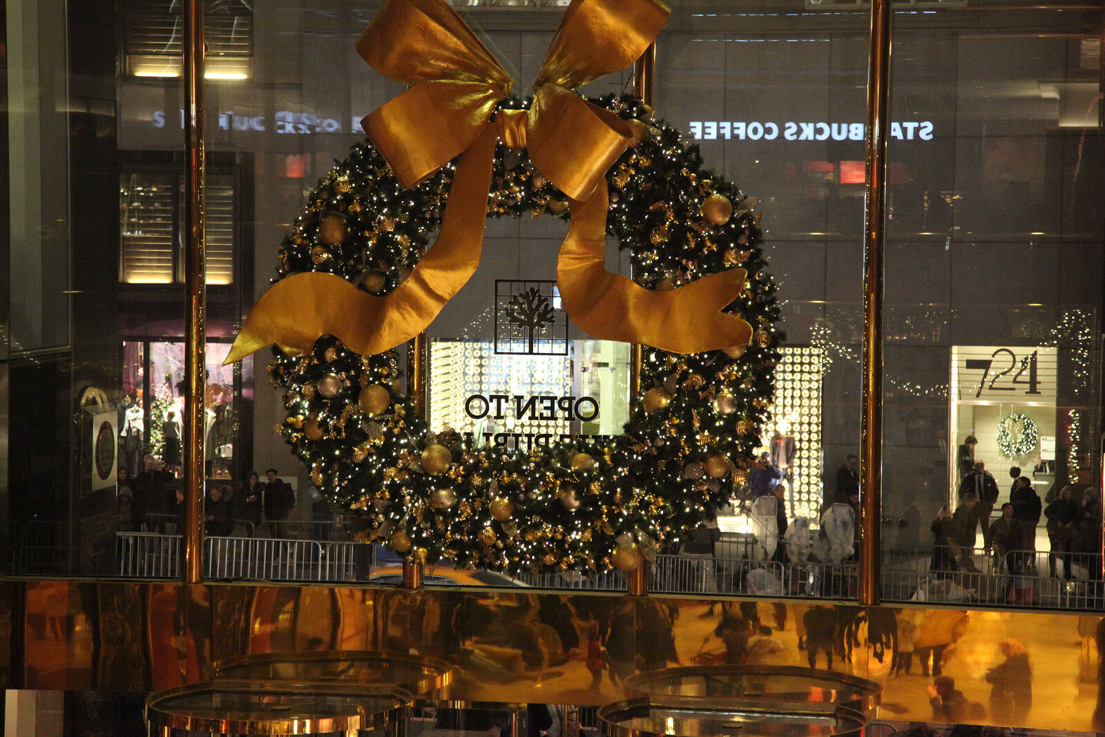
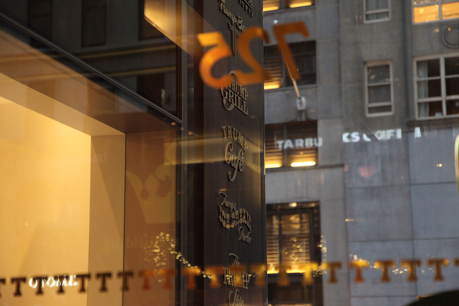
At the top of the arch there is a perpendicular continuation of the smooth polished granite surface that extends upwards 3ft 6in (106cm) from the outer edge of the soffit to create the appearance of an architrave for the entire entrance arch. Tightly placed on the architrave are ten letters fabricated from polished brass that form two five-letter words. Each letter is 34in (86cm) high. The first word is the family name of the owner of the building and the second word describes the type of building under consideration. The depth of the letters is such that their front faces are at the same level as the smooth facade of the building itself.
Stymie Extra Bold. This is the typeface of IBM, the BBC, New York Times Magazine—in custom form. Stymie Bold was used all over Britain in the 1960s—particularly for television studios and light industrial factories. It remained the typeface of authority in a non-Germanic context until the takeover by Helvetica in the 1990s. The use here is not a mistake. There is a connection to college logos and established authority forms. The New York Times continues to use its own version of Stymie Bold.
The fact that each word is five letters allows the text to be centered on the architrave, the gap between the two words revealing a thin joint between the polished granite slabs where they meet in the center. The lettering is a font with blocky serifs that create a boxy extension to every stem, ligature, and extender. The blocky serifs are all un-bracketed slab serifs. Viewed from the front, the entire entrance archway, including the architrave, is inset 4in (10cm) from the smooth black glass facade of the building.


The city is apparently abused. The previous building on the site has been carted away unceremoniously. This is supposed to be an act of vandalism and bad taste. But in fact the new “tower” takes its place politely within the existing power structure, making no claims to transformation and not even changing anything via architectural parody, brutality, or an arriviste gesture. Jameson noticed the same with the Bonaventura by Portman:
The Bonaventura, however, is content to “let the fallen city fabric continue to be in its being” (to parody Heidegger); no further effects, no larger protopolitical Utopian transformation, is either expected or desired. This diagnosis is confirmed by the great reflective glass skin of the Bonaventure, whose function I will now interpret rather differently than I did a moment ago when I saw the phenomenon of reflection generally as developing a thematics of reproductive technology (the two readings are, however, not incompatible). Now one would want rather to stress the way in which the glass skin repels the city outside, a repulsion for which we have analogies in those reflector sunglasses which make it impossible for your interlocutor to see your own eyes and thereby achieve a certain aggressivity toward and power over the Other.3
The entrance arch frames a symmetrically ordered, primarily glazed entryway into the building itself. The entryway is parallel to the sidewalk and divided into three distinct sections at the street level. At each outer edge of the entryway, a single-pane window 5ft (152cm) wide is framed at its lower edge by a brass baseplate 4in (10cm) deep. These two side windows have no visible frame on their outer edges. Continuing towards the center of the entryway, the two single-pane windows meet 4in (10cm) wide vertical brass sections that frame two sets of revolving doors. In between the revolving doors are a set of glass double doors that complete the entryway. Brass plates 6in (15cm) deep support the top and bottom of the double doors. The two outer windows, the two sets of revolving doors, and the central swing doors are all 9ft (274cm) high.
Framelessness is a dream fulfilled as we enter the regime of the minimal within architecture. This is where the aesthetic coding of this place starts to align with the values of car production and kitchen design more than it does with the notion of work or social exchange. The car is the place of individual fulfillment where luxurious materials are deployed towards the crude representation of desire. The advanced kitchen is also a place where cabinetry and appliances start to lose their handles, hinges, and frames. The car and the kitchen are the two legacy aspects of advanced modernism that carry individual desire and have the potential to be replaced. The building under consideration deploys the logic of the car and the kitchen in its aesthetic clues.

The central swing doors each have a 1in (2.5cm) diameter vertical push/pull rail positioned 4in (10cm) from the central meeting point. The rails extend vertically for the full 9ft (274cm) height of the doors. The push/pull rails are held away from the surface of the door by 1in (2.5cm) diameter brass tubes, 2in (5cm) deep. The push/pull rails are matched by the same rails on the interior of the glass doors. There is no further framing of the glass doors at their meeting point and the inner edges of the tempered glass panels meet cleanly, echoing the joint in the granite panels of the architrave. The brass of the swing doors is not ornamented in any way. On each side of the swing doors, the two sets of revolving doors are comprised of four sections, each perpendicular to the next, forming a perfect cross if viewed from above. The revolving door sections have rectangular brass push plates starting 3ft (91cm) from the ground. The push plates are 6in (15cm) deep and run from the central pivot of the door to the edge of each of the four revolving sections. Each push plate begins from the central pivot and continues outwards towards the outer edge of the door section, holding 1in (2.5cm) from the surface of the glass before turning in at an angle of twenty-five degrees, 4in (15cm) from the outer edge where it meets the frame. The revolving doors and the push plates are unadorned.
The entrance is standard. There are an excessive number of doors for such a small place. This standard arrangement complicates easy passage into and out of the building. There is confusion. These are the doorways of commerce—common from the office building. Ironically these are not the doorways of a store. There are mixed messages here. The postmodernist double-revolving-doors-around-central-double-doors arrangement creates the illusion that this is a place of work as much as a place of consumption. Production of brands and identities takes place at this site. We are allowed to share the entrance into the appearance of a Midtown work zone.


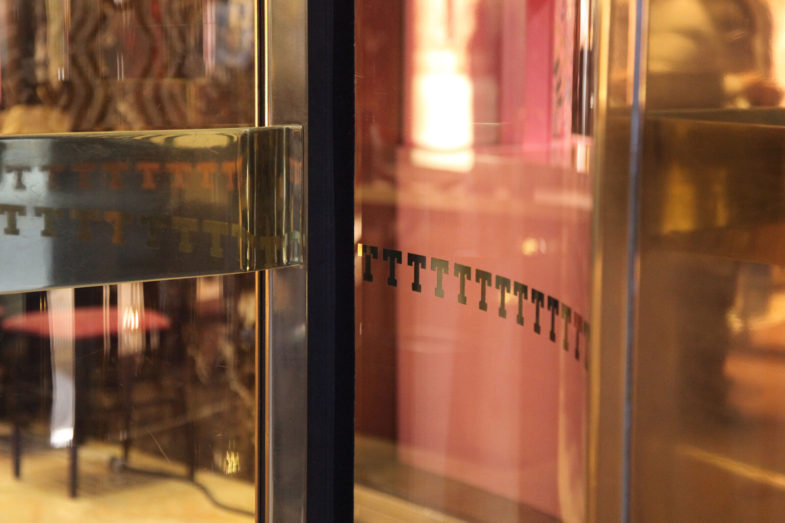
Running across this lower section of the entryway, two gilded stripes have been applied to the surface of the glass across its entire width. The stripes are formed from a repeated pattern that is made up of a horizontal, evenly spaced repeat of the twentieth letter of the alphabet gilded onto the surface of the glass. Each letter is 2in (5cm) high. The two stripes are parallel to each other. The first row is 3ft (91cm) from the ground and the upper row is 5ft (152cm) from the ground. The typeface is the same one used on the large sign that is mounted on the architrave of the entrance arch. The two stripes function as a repeated series of logos and draw attention to the glass to prevent anyone from walking straight into it. Centered on the right-hand window of the lower section of the entryway are three numbers in a different typeface than the one used on the architrave and the one which forms the stripes. The three numbers are gilded onto the glass in the same way as the two stripes. The numbers are 7, 2, and 5. The numbers are 6in (15cm) high and are positioned 6ft 5in (195cm) from the ground.
Logos, Logos, Logoi.
Back to Jameson for a second:
no doubt the logic of the simulacrum, with its transformation of older realities into television images, does more than merely replicate the logic of late capitalism; it reinforces and intensifies it. Meanwhile, for political groups which seek actively to intervene in history and to modify its otherwise passive momentum (whether with a view toward channeling it into a socialist transformation of society or diverting it into the regressive reestablishment of some simpler fantasy past), there cannot but be much that is deplorable and reprehensible in a cultural form of image addiction which, by transforming the past into visual mirages, stereotypes, or texts, effectively abolishes any practical sense of the future and of the collective project.4
Below the numbers, slightly off-center towards the revolving door on the right side of the entryway and sitting equidistant between the two stripes of letters that are gilded onto the glass, is a green and white circle that has been applied as a sticker directly to the glass. The sticker is 19in (50cm) in diameter. The green and white sticker carries a graphic image that shows a woman with long hair wearing a tiara or crown. She appears to be holding two fishtails, one in each hand—they may be her own. The window, revolving door, and double door section of the entrance are topped with a section of polished brass that extends the full width of the entrance arch. The polished brass section is 2ft 6in (76cm) high, and is completely smooth and unpatterned. Centered on this brass section and sitting directly above the double swing door are two sets of five letters that repeat the family name of the owner of the building and the type of building under consideration. These letters are 14in (35cm) high and the two words combined are 8ft (243cm) wide. This repeated deployment of lettering uses the same blocky serifed typeface that was used on the architrave of the entrance arch. The letters at this lower level are 12in (30cm) high and matte black, in contrast to the polished brass panel they are fixed to.


Such aspects have become a paradigm. Superficially, some things have been dropped. The taste for polished granite, brass, and dark glass exists now only in bleached form. Yet the clear anodized aluminum and bolted glass of the contemporary commercial space only appear to provide transparency—structurally, they deploy all the same opaque moves. The merging of the corporate and the commercial, or at least a sense that a space is in transition between the two. The way in which an approach to an entrance is already known from high-end residential units. The deliberate complexity of two sets of revolving doors and one single swing door that makes a doorman necessary—not because the residents of this place actually enter this way—but in order to echo the same “service structure” for those visual consumers who come by to witness and walk through, consume a logo and a martini.
Above this polished brass panel, five evenly spaced single-pane glass windows span the rest of the entrance elevation above the doors and continue up to meet the soffit. The glass is frameless but is pinned with eight 4in (10cm) round plates at 5ft (152cm) evenly spaced vertical intervals to four 6in (15cm) wide mullions that provide lateral support to the glass. Each pane of glass is 4ft 6in (136cm) wide and 16ft (487cm) high. On the center pane of glass, a logo and a series of letters and numbers have been gilded to the surface of the glass. The logo, letters, and numbers occupy the bottom third of the central glass panel.

This is a public place. This door leads into an area that has already been paid for by the citizens of this city. Now those people are paying again. This is a building that carries coding from an earlier time as the transition to the frameless and the seamless was starting to be articulated within a design aesthetic where the structure becomes the logo and the logo floats free of its function. This has all been seen and said and recognized so many times before in the complex analysis that was postmodern theory. Now is not the time to cease a granular analysis of the old/new spaces of power—not a moment to compare it to Versailles or dictator chic (these were later “backward renovations”—historical revisionism of the self). It is a moment to look carefully with eyes wide open. A concrete analysis of a concrete situation layered in aluminum and dark glass.
The logo on the central glass panel is a simplified graphic representing a tree that has been overlaid by the thin outline of a square that creates a box around the tree and is subdivided into a five-by-five evenly spaced grid. The simple tree graphic does not bear leaves. Below this are three words stating that the building is open to the public. Below this statement are two times of day. The time the building opens and the time it closes.
Ballard still said it best:
The more arid and affectless life became in the high-rise, the greater the possibilities it offered. By its very efficiency, the high-rise took over the task of maintaining the social structure that supported them all. For the first time, it removed the need to suppress every kind of anti-social behavior and left them free to explore any deviant or wayward impulses. It was precisely in these areas where the most important and interesting aspects of their lives would take place. Secure within the shell of the high-rise, like passengers on board an automatically-piloted airliner, they were free to behave in any way they wished, explore the darkest corners they could find. In many ways, the high-rise was a model of all that technology had done to make possible the expression of a truly free psychopathology.5
Fredric Jameson, Postmodernism, or, The Cultural Logic of Late Capitalism (Durham, NC: Duke University Press, 1992), 47.
Ibid., 51.
Ibid., 41–42.
Ibid., 54.
J. G. Ballard, High-Rise (1975).