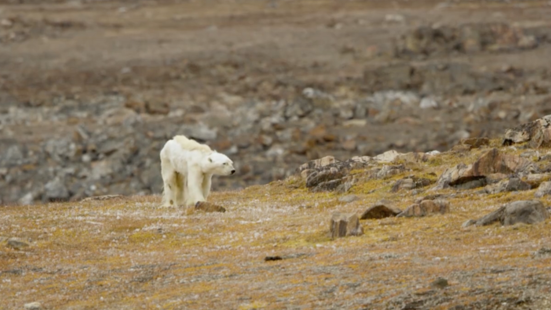
Accumulation - Wendy Hui Kyong Chun - On Patterns and Proxies

On Patterns and Proxies, or the Perils of Reconstructing the Unknown

Wendy Hui Kyong Chun

Still frame from “Heart-Wrenching Video Shows Starving Polar Bear on Iceless Land,” National Geographic, December 7, 2017. Footage: Paul Nicklen/SeaLegacy.org.

Accumulation
September 2018

What role do—and should—images play in combatting global climate change? Since we experience weather, not climate, images have been used to register the effects of global climate change: from photographs of melting icebergs and starving polar bears to scientific graphs of historical temperature increases. These illustrations are proxies—stand-ins or representatives—for rising global temperatures. These image-making processes, however, have been all too successful in opening climate up to cultural inquiry and political mobilization. They have been used both to convince the public that climate change is real and to foster doubt and denial. Proxies both reduce and introduce uncertainty. By bridging the unknown or absent, they introduce the specter of the unknowable. They make politics necessary.

Crucially, the same image can foster both belief and mistrust. National Geographic’s “heart-wrenching video [of] a starving polar bear on iceless land” on Summerset Island, for example, went viral—sparking outrage over the effects of global climate change.1 In response, conservative news outlets and questionable wildlife “conservation” sites, such as Polar Bears International, spread competing explanations for the bear’s condition and accused SeaLegacy of “climate change porn.”2 The more compelling and popular the image, the more controversy, analysis, and conspiracy theories it accretes and disseminates.

This phenomenon reveals the insights and limitations of twentieth century semiotics and cultural studies. Daily, conspiracy theorists testify to the prescience of Eve Sedgewick’s warning against paranoid reading.3 Deniers perversely answer Roland Barthes’ call for polysemy and Stuart Hall’s call for resistant readings.4 As Ien Ang argued so many years ago, capitalism accelerates meaning making and difference; it produces “postmodern audiences.”5

Given this, the opening question can be revised: what role do—and should—image-making play in combatting global climate change, at a time when critical theory itself is not dead but rather undead, constantly resuscitated via planet-destroying conspiracy theories?

The controversy over Dr. Michael E. Mann’s “hockey stick” is incisive in reflecting upon and responding to this question. Although charismatic mega-fauna and dramatic natural settings spark interest and debate, the most influential—and controversial—representations of global climate change are line graphs. Mann first published his graph, charting changes in mean temperature in the Northern hemisphere from 1400 to 1995, in 1998 in Nature, and published an updated version, which included the period from 1000-1998, the following year in PNAS.6 The 2001 Intergovernmental Panel on Climate Change (IPCC) report featured the 1999 graph in the “Summary for Policymakers” section, and politicians such as President Bill Clinton and Vice President Al Gore used it as proof of the impact of the human use of hydrocarbons on climate. Simultaneously, the image was attacked both by social scientists and physicists, whose work was picked up by media outlets such as the Wall Street Journal and MIT Technology Review, and by politicians in their respective domains.7 Further, Mann was personally attacked as a proxy for “bad science”: he and his family received death threats; his academic records were unsuccessfully subpoenaed by Republican law-makers, and his emails were hacked as part of “climate-gate.”8 Why, or perhaps how could a simple graph provoke so much anger and controversy?

Michael E. Mann, Raymond S. Bradley and Malcolm K. Hughes’s 1999 “Hockey Stick” graph, as featured in the 2001 Intergovernmental Panel on Climate Change (IPCC) report.

Sticking to the Past

Given that Mann’s hockey stick makes no predictions about the future—the last year included in either graph was 1998—the controversy seems bizarre. Mann is a paleoclimatologist. He does not predict future climate trends via general circulation models, but rather reconstructs past climates using statistical methods and proxy data, such as measurements of tree rings and ice cores. As Mann notes, “knowing both the spatial and temporal patterns of climate change over the past several centuries remains a key to assessing a possible anthropogenic impact on post-industrial climate.”9 The past, that is, can reveal the impact of the more current use of hydrocarbons.

The 1999 graph was so controversial because it included reconstructions of the average temperature in the Northern Hemisphere from 1000-1400—during the so-called medieval warming period (also called the medieval climate anomaly). During this period, parts of Europe, China, Australia and North America experienced unusually high temperatures. Deniers, such as President Donald Trump’s first Energy Secretary Rick Perry, use this phenomenon to claim that that oceans and the natural environment—rather than humans—are the main control knobs of climate change.10 The argument goes: if the earth has undergone a similar period of warming in the past, then humans cannot be blamed for the current situation. The hockey stick, however, showed that warming during the twentieth century—the blade of the stick—dwarfed any rise in temperature during this earlier period. Thus, humans must be responsible for the increasing mean temperature, since the main difference between past and present is the human burning of fossil fuels.

The “scientific” attacks on Mann focused on his use of proxies and statistical methods in his mean temperature reconstruction. Mann, like paleoclimatologists before him, drew from many different types of proxies for temperature—tree ring measurements, ice cores, ice melts, human records, etc.—that are unevenly sampled both temporally and spatially. In particular, there is an overwhelming plethora of tree ring data, which represents “only a restricted region of the globe, the midlatitude continents.”11 The other key regions—the poles, oceans and tropics—are represented by less abundant proxies: data drawn from corals, ice cores, and lake sediments. If all proxies are treated equally, “the sheer amount of tree ring data [would] overwhelm the less abundant information from other proxy records … [and thus] weight our results toward the midlatitude continents.”12

To create a “fair fight” between these different forms of data, Mann used what is called Principal Component Analysis (PCA) and Singular Value Decomposition (SVD), methods previously introduced into meteorology and oceanography by Rudolf Preisendorfer. Although Mann described PCA as a new technique, it was originally developed in the early twentieth century by Karl Pearson, a “father” of modern statistics, biometrician, and eugenicist.13 PCA resolves a set of possibly correlated data points—that is, observations that include factors which may overlap with each other—into a set of linearly uncorrelated orthogonal “principal components” by determining the “eigenvectors” of the correlation matrix.

Dominant Principal Components, as featured in Mann, Bradley, and Hughes, 1998

In effect, PCA breaks data down into a set of vectors to reveal significant patterns: the first principal component will explain the most variation, since most of the data lies along its axis; the second the next, and so on. Most simply, PCA and eigenvector analysis in general re-center data around a new set of axes, which makes mathematical calculations much easier.

Mann et al. used PCA in two ways: first, they used PCA to “even out” the data spatially. Second, and more controversially, they used PCA to determine the most leading patterns of variation in their larger dataset. Each eigenvector they produced was resolved into both a spatial component—an “empirical orthogonal function” (EOF)—as well as a principal component over time. According to Mann, the first eigenvector describes 88% of the variability in global mean temperature and 73% of the variation in the hemispheric mean temperature. It clearly shows a rise in mean temperature during the twentieth century. The subsequent eigenvectors reveal spatial variability: the second shows a modest La Niña-like cooling trend in the eastern tropical Pacific. EOFs explain variation in decreasing intensity, but nevertheless all still point to trends.

EOFs for the five leading eigenvectors, as featured in Mann, Bradley, and Hughes, 1998.

Mann used twentieth century data to determine these patterns of variation because all proxies were present during this time period. They then calibrated “each of the indicators in the multiproxy data against these empirical eigenvectors at annual-mean resolution during the 1902-80 training period” using SVD, which helped produce reconstructed principal components over a longer historical time period. Each principal component was a weighted sum of the some or all of the measured variables or proxies. The first principal component might, for instance, weigh one proxy by .5, and another by .25, so that each proxy is included relative to all the others. To verify these reconstructed principal components, they tested these predictions against actual data for the period before the twentieth century (hence the error bars above and below the hockey sticks). They also changed the number of proxies and eigenvectors used during different time periods, since not all proxies were available or pertinent for each eigenvector and time period. The reconstructions from 1820 onwards, for instance, used the full multiproxy network of 112 indicators and resolved 11 eigenvectors, whereas the period from 1820–1760 took 93 indicators and resolved at least 9 eigenvectors. The number of available proxies and resolved eigenvectors diminished with each time period. Within the five most significant reconstructed principal components they uncovered, the first shows an increase in temperature over time, and the second shows a slight decrease in temperature, in line with its associated EOF. Through this analysis, they determined that the most important pattern was one of temperature increase in the Northern Hemisphere.

The attacks Mann received focused on his use of proxies. Willie Soon and Sallie Baliunas, two physicists based at the Harvard-Smithsonian Center for Astrophysics, argued that multi-proxy networks such as those that are used for PCA were inherently inaccurate.14 They wrote that “the results from the proxy indicators cannot be combined into a hemispheric or global quantitative composite… but should rather be considered as an ensemble of individual expert opinions.”15 That is, each individual proxy—each tree ring and ice core, for instance—should be given an equal voice. Given the overwhelming amount of the tree ring data from midlatitude areas, this would mean only being able to hear the many sets of tree ring data, which, not surprisingly, show global warming during the medieval period. This article, which was championed by politicians such as US Senator James M. Inofe, was shown to be riddled with errors and the peer review process that led to its publication deeply flawed. The chief editor of the journal Climate Research and critic of Mann’s research, Hans von Stroch, and several other editors, resigned in protest over the editorial process.16

Mann was also attacked for his use of the shortened period (1902–1980) to calibrate principal components for the entire timespan of his inquiry. Canadian businessman Stephen McIntyre and social scientist Ross McKitrick reviewed Mann’s article and, in addition to finding several transcription errors in the data, alleged that Mann’s use of the shorter calibration period skewed the results so that any data fed would produce a hockey stick.17 They redid the analysis so that the entire period (1400-1998) was used, and found that the warming trend went from principal component 1 to 4. They then only used the first two principal components—which they argued explained most of the variation in their reconstruction—and the warming effect disappeared. This article was published in the controversial journal Energy and the Environment, and it garnered much attention, especially in the non-academic press. The Wall Street Journal featured an article on it and portrayed the businessman with backing from the petroleum industry as a David, taking on Mann the Goliath, who was then an assistant professor at UVA.18 Yet this paper was also deeply flawed, with their difference in findings due to the fact that McIntyre and McKitrick removed two thirds of the proxy data Mann used for the fifteenth and sixteenth centuries.19

The criticisms of Mann’s hockey stick were most effectively silenced by a 2006 report from the National Academy of Science and a report by physicist Richard Muller at UC Berkeley, a former climate change denier who was funded by the Koch brothers to revisit the hockey stick.20 Muller had previously referred to McIntyre and McKitrick’s work as a “bombshell” that revealed the bad science that fueled global climate change research. In his 2006 report, however, Muller used “real” data to reconstruct the mean temperature in the Northern hemisphere and found it to be, in fact, much worse than Mann’s diagram. Conceding the point without issuing a direct apology, Muller stated: “When we began our study, we felt that skeptics had raised legitimate issues, and we didn’t know what we’d find. Our results turned out to be close to those published by prior groups. We think that means that those groups had truly been very careful in their work, despite their inability to convince some skeptics of that. They managed to avoid bias in their data selection, homogenization and other corrections.”21 In contrast to the death threats and harassment Mann received, Muller won a prize from Foreign Policy for his about-face.

Mann not only used proxies to produce a proxy—the hockey stick—he himself became attacked as a proxy. A proxy, that is, for the alleged “bad science” that purportedly buttresses false evidence for global climate change. Explaining the harassment Dr. Benjamin D. Santer received for his work on the 1995 IPCC report, Mann calls the practice of isolating and making an example of an individual scientist the “Serengeti strategy,” after the practice of predators on the Serengeti to pick off vulnerable individuals from the rest of the herd.22 These scientists are vilified not simply as individual bad scientists, but as representatives of the herd as a whole.

Embracing Proxy Politics

Mann attributes the ferocity of the attacks against the hockey stick to its graphic, “easy to understand” nature.23 He writes: “the controversy that the hockey stick would ultimately generate, however, had little to do with the depicted temperature rise in and of itself. Rather, it was a result of the perceived threat this simple graph represented to those who are opposed to governmental regulations or other social restraints aimed at protecting our environment and the long-term prospects for the health of our planet.”24 The power of the hockey stick stemmed from its simplicity and its easy duplication.

Mann has since embraced—rather than eschewed—images. Once pilloried via a cartoon YouTube video which falsely accused him of “hiding the decline,” Mann has partnered with cartoonist Tom Toles to produce an illustrated book about global climate change, entitled The Madhouse Effect: How Climate Change Denial Is Threatening Our Planet, Destroying Our Politics, and Driving Us Crazy.25 Each chapter is prefaced by cartoons that satirize the arguments of deniers, point to the effects of the privatization of science, and illustrate the possibly catastrophic effects of global climate change. Rather than back away from politics or images, Mann has amplified and sharpened them.

Illustration from Michael E. Mann and Tom Toles, The Madhouse Effect, 2016.

Mann’s move towards images is important. Not only does it allow him to reach out to a more general audience in order to register both the reality of global climate change and the tactics of global climate change deniers, it makes clear the political engagements that must accompany any use of proxies. This lesson resonates far beyond global climate change studies: proxies are also central to Big Data analyses. E-scores to determine our credit-worthiness, predictive policing models, and recommendation engines all use proxies, and in many cases to reinforce inequality. Like Mann’s hockey stick, these other models are accused of being biased because they use proxies.26

Correlations are used to determine proxies. In statistics and economics, proxies correspond linearly; they associate with hidden or unknown variables. The proxy is literally a stand-in or a surrogate. According to the Oxford English Dictionary, the word “proxy” stems from the classical Latin term “procurator,” which means “manager, superintendent, agent, steward, financial administrator of a province, attorney,” but which became, in post-classical terms, “proctor in the ecclesiastical courts … [and] university official.” Proxies were first human substitutes or agents, then payments given in lieu of services.27 Proxies, though, seem less independent than agents: they are always tethered to their source; they’re not supposed to get a cut or go rogue. Over time, proxies became things that ensured direct and equivalent substitution.28

Proxies are not innocent, but neither are they inherently guilty. They are central to both understanding global climate change and to creating what Cathy O’Neill has called “weapons of math destruction.” By setting up a relation to the unknown or absent, they introduce uncertainty, even as they reduce it. Proxies are necessary and inadequate: indeed, they point to inadequacies in direct knowledge. As Christoph Rosol has argued, paleoclimatology must use and negotiate proxies, which means that it troubles the boundary between data and model.29

As Boaz Levin and Vera Tollmann have argued, proxies are fundamentally ambivalent, and our current politics engages proxies at all levels.30 The ambivalence of proxies is key.31 A proxy embodies what Jacques Derrida called a pharmakon: a supplement or intermediary “a philter, which acts as both remedy and poison.”32

Proxies absolve one of responsibility—a payment in lieu of hospitality—by creating new dependencies and relations. For proxies touch the unknown: they extend the archive, the knowable, by capturing or syncing to what is not there. Proxies spark controversy. Thus, we cannot know the types and valences of inquiry and mobilization that image-making processes will open up in advance. But this should not dissuade us from using proxies or image-making processes to mobilize: we must if we are to create a more just and viable future. It is not their mere existence, but their relations to the unknown, that matter.

Notes
1

Sarah Gibbens, “Heart-Wrenching Video Shows Starving Polar Bear on Iceless Land: Lack of sea ice is making it more difficult for polar bears to find food,” in National Geographic (2017).

2

David Leafe, “Are these photos REALLY proof that polar bears are being killed by climate change? Doubts raised over claims after it emerges that no post mortem was carried out,” Daily Mail, December 29, 2017; Polar Bear Science, “‘One starving bear is not evidence of climate change, despite gruesome photos,” Polar Bear Science, December 9, 2017, .

3

Eve Kosofsky Sedgwick, Touching feeling: affect, pedagogy, performativity (Durham: Duke University Press, 2003).

4

Roland Barthes, S/Z (New York: Hill and Wang, 1974); Stuar Hall, “Encoding, Decoding,” in The Cultural Studies Reader, ed. Simon During (New York: Routledge, 1999).

5

Ian Ang, “In the Realm of Uncertainty: The Global Village and Capitalist Postmodernity,” in Living Room Wars: Rethinking Media Audiences, ed. Ian Ang (New York: Routledge, 1996).

6

Michael E. Mann, Raymond S. Bradley, and Malcolm K. Hughes, “Global-scale temperature patterns and climate forcing over the past six centuries,” Nature 392 (1998): 779; Michael E. Mann, Raymond S. Bradley, and Malcolm K. Hughes, “Northern hemisphere temperatures during the past millennium: Inferences, uncertainties, and limitations,” Geophysical Research Letters 26 (1999): 759–762.

7

Antonio Regalado, “In Climate Debate, The ‘Hockey Stick’ Leads to a Face-Off: Nonscientist Assails a Graph Environmentalists Use, And He Gets a Hearing,” The Wall Street Journal, February 14, 2005; Ruchard Muller, “Global Warming Bombshell: A prime piece of evidence linking human activity to climate change turns out to be an artifact of poor mathematics,” MIT Technology Review, 2004.

8

Michael E. Mann, “I’m a scientist who has gotten death threats. I fear what may happen under Trump,” Washington Post, December 16, 2016.

9

Mann et al. (1998), 779.

10

Steven Mufson, “Rick Perry just denied that humans are the main cause of climate change,” The Washington Post, June 19, 2017.

11

Michael E. Mann, The Hockey Stick and the Climate Wars: Dispatches from the Front Lines (New York: Columbia University Press, 2012), 45.

12

Ibid.

13

Karl Pearson, “LIII. On lines and planes of closest fit to systems of points in space,” The London, Edinburgh, and Dublin Philosophical Magazine and Journal of Science 2 (1901): 559–572.

14

Willie Soon and Sallie Baliunas, “Proxy climatic and environmental changes of the past 1000 years,” Climate Research 23 (2003): 89–110.

15

Soon and Baliunas: 89.

16

Mann, The Hockey Stick and the Climate Wars (2012), 120.

17

Steven McIntyre and Ross McKitrick. 2003. “Corrections to the Mann et. al (1998) Proxy Data Base and Northern Hemisphere Average Temperature Series,” Energy & Environment 14, 6 (2003): 751–771.

18

Regalado, “Climate Debate.”

19

Mann, The Hockey Stick and the Climate Wars (2012), 123.

20

Geoff Brumfiel, “Academy affirms hockey-stick graph,” Nature 441 (2006): 1032; Richard A. Muller, “The Case Against Global-Warming Skepticism,” The Wall Street Journal, October 21, 2011.

21

Eugene Robinson, “The scientific finding that settles the climate-change debate,” The Washington Post, October 24, 2011.

22

Mann, The Hockey Stick and the Climate Wars (2012), 290.

23

Mann, The Hockey Stick and the Climate Wars (2012), xvii.

24

Ibid.

25

Mann, The Hockey Stick and the Climate Wars (2012), xv; Michael E. Mann, The Madhouse Effect: How Climate Change Denial Is Threatening Our Planet, Destroying Our Politics, and Driving Us Crazy (New York: Columbia University Press, 2016).

26

As Cathy O’Neill has documented in Weapons of Math Destruction: How Big Data Increases Inequality and Threatens Democracy, zip codes—amongst many other proxies—are central to the operations of weapons of math destruction (WMDs). WMDs “draw statistical correlations between a person’s zip code or language patterns and her potential to pay back a loan or handle a job. These correlations are discriminatory, and some of them are illegal.” Cathy O’Neil, Cathy, Weapons of Math Destruction: How Big Data Increases Inequality and Threatens Democracy (New York: Crown, 2016), 17–18.

27

According to the Oxford English Dictionary, the term proxy is a synonym for agent, “a person who or thing which acts upon someone or something; one who or that which exerts power; the doer of an action.”

28

Proxies are “document{s} empowering a person to represent and act for another”; or, in the Christian Church, “an annual payment by incumbents… as a substitute for providing for or entertaining a visiting bishop or his representative.”

29

Christoph Rosol, “Data, Models and Earth History in Deep Convolution: Paleoclimate Simulations and their Epistemological Unrest,” Berichte zur Wissenschaftsgeschichte 40 (2017): 120–139.

30

Boaz Levin and Vera Tollmann, “Introduction: Proxy Politics,” in Proxy Politics: Power and Subversion in a Networked Age, ed. RCCP (Research Center for Proxy Politics) (Berlin: Archive Books, 2018).

31

Proxies are central to my current book project, Discriminating Data: Individuals, Neighborhoods, Proxies.

32

Jacques Derrida, “Plato’s Pharmacy” in Dissemination, ed. Jacques Derrida (London: The Athlone Press, 1981).

Accumulation is a project by e-flux Architecture and Daniel A. Barber produced in cooperation with the University of Technology Sydney (2023); the PhD Program in Architecture at the University of Pennsylvania Weitzman School of Design (2020); the Princeton School of Architecture (2018); and the Princeton Environmental Institute at Princeton University, the Speculative Life Lab at the Milieux Institute, Concordia University Montréal (2017).

Category
Image, Data & Information
Subject
Climate change, Anthropocene, Mathematics, Science
Return to Accumulation

Wendy Hui Kyong Chun is the Canada 150 Research Chair in New Media at Simon Fraser University. She has studied both Systems Design Engineering and English Literature, which she combines and mutates in her current work on digital media. She is currently Visiting Scholar at the Center for Media@Risk at the Annenberg School of Communications, University of Pennsylvania.

Advertisement
Subscribe

e-flux announcements are emailed press releases for art exhibitions from all over the world.

Agenda delivers news from galleries, art spaces, and publications, while Criticism publishes reviews of exhibitions and books.

Architecture announcements cover current architecture and design projects, symposia, exhibitions, and publications from all over the world.

Film announcements are newsletters about screenings, film festivals, and exhibitions of moving image.

Education announces academic employment opportunities, calls for applications, symposia, publications, exhibitions, and educational programs.

Sign up to receive information about events organized by e-flux at e-flux Screening Room, Bar Laika, or elsewhere.

I have read e-flux’s privacy policy and agree that e-flux may send me announcements to the email address entered above and that my data will be processed for this purpose in accordance with e-flux’s privacy policy*

Thank you for your interest in e-flux. Check your inbox to confirm your subscription.