

I.
Imagine, if you must, walking into an exhibition space and encountering work so oblique you don’t know what to make of it. You start looking for text. First on the wall, then, by the door or a desk someplace. You scan whatever copy you can find, searching for coordinates, landmarks, bits of conceptual breadcrumbs, or a bright stripe of familiarity amidst the thicket of ideas. You hope to find some meaning in the work in front of you. Sometimes you do.
The average museumgoer stands in front of a work for fifteen to thirty seconds. An average reader can comprehend about two hundred words per minute. A viewer who reads a standard wall label (which averages about one hundred words) will spend as much time reading as looking. The wall labels, introductory texts, and section texts condition the pace at which visitors move through an exhibition, the amount of information they receive beyond any preexisting knowledge, and their sense of what the museum wants them to know or learn over the course of the show. To group together these three textual mechanisms—the introductory wall text, the section texts, and the labels—is, in a way, to go against a museum’s best practices, since each of these plays a different role in communicating an exhibition’s thesis and pace. But they all support each other in an endless loop of authority.
What do we look at when there’s a text present? Where do our eyes go? Vinyl lettering on the wall near the entrance to a show colors it, shading it thematically or in terms of an artist’s biography. If a label is aligned with a painting, eyes wander between text and image, comparing authority and subjective experience, looking for the places where text touches what it describes. Guides, maps, and lists plot the works in a sequence, delineating ways of moving through the space. All of these devices—wall texts, labels, press releases—are built into viewing art. Reading has become part of looking.


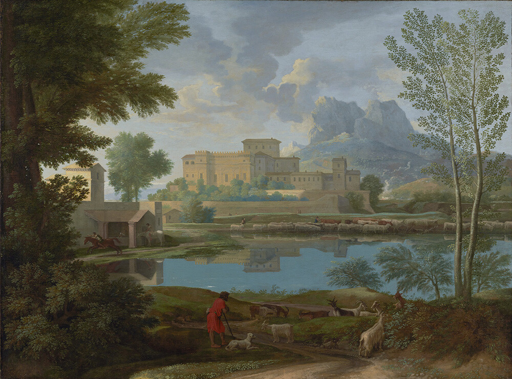
Nicolas Poussin, Landscape with a Calm (1650–51). Oil on canvas.
II.
One of the most personal and comprehensive accounts of looking at art began in January 2000, when art historian T. J. Clark arrived at a six-month research residency at the Getty Institute in Los Angeles. He had no exact research program—“the most likely bet was Picasso between the wars”—and during his first days he wandered around the Getty Museum in search of specific paintings.1 Clark titled the resulting study The Sight of Death: An Experiment in Art Writing, though “an experiment in attention” might have been more accurate.
Clark spent six months visiting, nearly every day, two paintings by Nicolas Poussin: Landscape with a Calm (1650–51) and Landscape with a Man Killed by a Snake (1648, on loan to the Getty from the National Gallery, London). The Sight of Death records Clark’s thoughts day by day, giving us an expanded sense of what looking might mean for the art historian: Clark shifts from descriptions of the works to accounts of the his steps through the museum toward them; he reassesses the political possibilities of art history; he writes about Greek religion, times of day (both the time depicted in the painting and the hours in which he goes to look at them), travels through the West Coast, and what is valuable enough to write down as description (and what isn’t).
I download a high-quality JPEG of Landscape with a Calm from the Getty’s website (the 17.58 MB image is freely available to download under the institution’s open content policy2) and examine it onscreen, zooming in and out, running my fingers on the trackpad to lead me through the image: the leaves on the trees, the horse riders on the left, the Italianate architecture of the castle that dominates the image even though it isn’t in the foreground. None of this amounts to the hours of looking Clark clocked in, but it does add up to more attention than I would usually give to any image I download off the internet and save onto my desktop. But there’s another form of attention: when I google “Landscape with a Calm poussin,” the second result is a YouTube video produced by the Getty.3 It’s a static shot of the painting, accompanied by an audio track delineating some details about the painting (year, subject), and a short section in which Denise Allen, then associate curator of painting at the museum, talks about what painters learned from Euclidean geometry.

The text of the audio track sounds familiar. In language, in approach, it echoes a certain standard: it gives a date, title, and a medium, the name of the artist, a quick description, and a short, digestible explanation of what the work might mean. All the checkboxes of a wall label. My eyes no longer wander across the JPEG, they focus on the larger picture since the curator discusses geometry and spatial configuration. Does reading wall labels allow us to escape the difficult task of looking? Or commit us more totally to it? Without the feeling of the body in the museum space, while looking digitally it’s easy for me to register exactly how the text authors the way I look.
III.
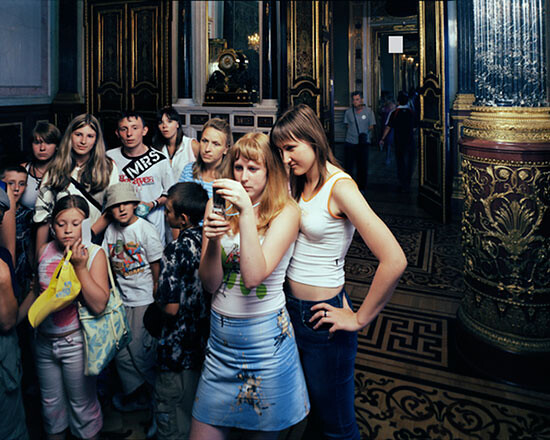
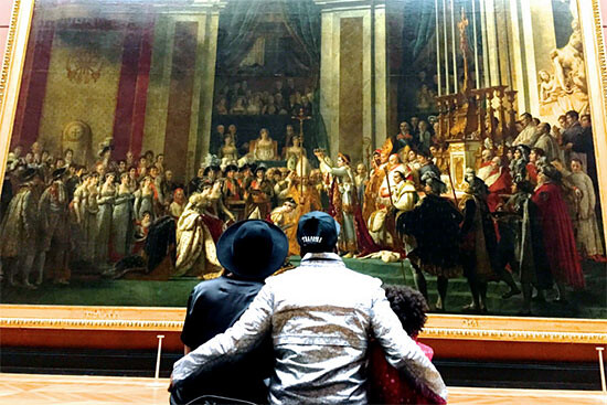
It is enough to compare Thomas Struth’s series of photographs taken in museums to the promotional images on those same museums’ websites to see how looking has changed over time. The peopled installation shot is a trope because it helps register scale. (The art historical term is “staffage,” which is the word for the characters and animals populating a painting of which they are not the subject. The shepherds, goats, and horses in Landscape with a Calm are all staffage.) This kind of installation shot also makes the museum seem lively, a communal space where all sorts of activity happens, though apparently this mainly involves taking photographs. The “Visit” page on MoMA’s website includes an image (taken from Flickr) of a young man photographing a close-up of Monet’s Water Lilies (1914–26) from the museum’s collection. There’s #museumselfie day (January 21). When Beyoncé and Jay Z visited the Louvre in 2014 they posted pictures on Instagram of themselves in front of the Mona Lisa and another image of their backs (with their toddler Blue Ivy) looking at Jacques-Louis David’s Coronation of Napoleon (1807).
Cell-phone photography conditions much of what looking at art in pubic collections is now. It’s a comfortable looking, a familiar version—watching by way of a screen. It’s also often an uncomfortable image: Struth’s photographs (especially in the “Audiences” series) are populated by staring, gaping masses. Some of them are scratching their heads or digging fingers into their mouths. There are some cell phones and digital cameras in Struth’s images (Hermitage 3 and Hermitage 5, 2005), but these are a bit too early for the Instagram-oriented museum. In Hermitage 1 there are two women listening to audioguides and in Audience 2 (Florence, 2004) a woman in a sundress and sneakers is reading a printed book that looks like a guide to the work in front of her (Michelangelo’s David).
Is it more looking or less looking if a viewer is watching the work on a cell-phone screen while standing in front of it? Is it more or less concentration if a viewer listens carefully to the audioguide, his or her eyes resting on the work in front? Is looking without an audioguide, without text, more looking? Is reading the wall text more learning?
IV.
“What does circa mean?”
This question appears in the list of issues MoMA found visitors are most concerned with when reflecting on wall labels. Other questions include “Is this really art?” and “How did the artist make this?”4 The most common queries are for background information about the artist, the method of a work’s production, and its value. Hence the standard information included in a wall label—artist’s name, work title, date of execution, medium, and a short text that attempts to do one or some of the following: (1) place the work within a larger historical framework; (2) reflect on the artist’s intentions; (3) assert the contribution/value of the particular work on display; and if the work is in a temporary exhibition, (4) support the show’s ideas by using the work as an example thereof.5
This assigns a wall label a particular, crucial role. Not only does it provide information about the work; it is also the main vehicle for museum audiences to internalize the art-historical trajectory the institution ascribes to a work by linking it to a movement, to historical precedents, to sociopolitical concerns, or to an artist’s larger body of work. The historicizing impulse in wall labels and texts, however, conceals a contradiction: a wall text or label is a temporary, undocumented construct. It could be updated, in the case of a collection display, or taken off the wall, in the case of a temporary exhibition, but it is rarely made available on the museum’s website, for example, as a historical document in its own right.
V.
In April 2015, LA Times art critic Christopher Knight published an article taking to task the Whitney Museum of American Art. Knight claimed that in a wall text featured in “America Is Hard to See,” the exhibition inaugurating the Whitney’s new Downtown Manhattan home, the museum misrepresented his 1993 review of that year’s Whitney Biennial. According to Knight’s account—there is no record of the copy anywhere else—the wall text read, “Christopher Knight’s review was a typical one, noting the unprecedented presence of art by women, ethnic minorities, and gays and lesbians, while decrying the show’s artistic quality.” The critic condemned the Whitney’s “shabby” wall text, which reads as though Knight ascribed the lack of quality to the participation of marginalized artists, rather than his original intention, which was to commend the curators for creating a “Biennial that looks more like America,” while faulting their choice of works by these artists, which predictably dealt largely with the artists’ exclusion.6
The Whitney’s response:
the text was collectively prepared by the Whitney’s curatorial, education and publication departments. They met to review [Knight’s] complaint and, while saying they did not intend to draw “a causal relationship” between his review’s praise for diversity and its negative assessment of the show, did understand “how it could be misconstrued.”
The wall text was subsequently altered, but not to Knight’s satisfaction. Why is there no common archive of wall texts to which disputes such as these can be referred? Institutional authority begins by placing some part of itself outside history. When a wall text has done its job, it coincides with history so entirely that its own history is insignificant, in the way that the history of the grains of sand in which Pythagoras first drew his famous theorem are insignificant. Only when a wall text is wrong or perceived to be wrong does it become part of the story. An archive of wall texts, then, would be like an ever-expanding compendium of the illicit history of the museum and the writing thereof.
VI.
If the museum wants its wall text to be as transparent as possible, the commercial gallery simply wants it to be: wall text is the gallery’s object of desire. This is why galleries have disposed of it entirely and do not produce it themselves. Collect wisely and wall text is your reward. Buy this and someday your name, too, might appear within the medium of record, just below a description of your triumphant taste! Hence the central role played by the gallery press release, which, unlike a wall text, exists less to edify an existing value than to delineate the future significance of what is present somewhere nearby. The exuberant language of these releases is a performance of wall text, distilling its social-historical logic by way of an exaggerated and aggressive imitation.

VII.
The complex authority of wall texts is what artist Fred Wilson exploits in projects like the exhibition “Mining the Museum” (1992, Maryland Historical Society). Wilson culled objects from the museum’s collection and presented them in a way that highlighted the museum as a “site of institutional racism.”7 The life-size sculptures of Indians placed outside cigar stores in the United States were shown accompanied by labels identifying the store owners who commissioned them. An archival photograph of two slaves with three white kids emphasized the former’s presence in the label: “African-American domestics with charges.” And a pair of iron slave shackles were joined to a presentation of nineteenth-century silverware made in Baltimore, the label identifying them as contemporaneous (c. 1793–1872), using the devices of art history to underline a new and different account of the world historical kind.
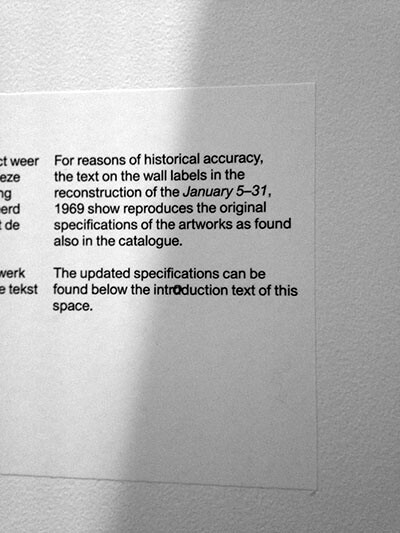
This intricate relationship to history and authority has become comic amidst the current trend of recreating historical shows. In a recent exhibition at the Stedelijk Museum in Amsterdam on Seth Siegelaub’s work as a curator, art dealer, publisher, and textile collector/scholar, a wall text read: “For reasons of historical accuracy, the text on the wall labels in the reconstruction of the January 5–31, 1969 show reproduces the original specifications of the artworks as found also in the catalogue. The updated specifications can be found below the introduction text of this space.” The section dedicated to the show was a one-to-one scale model based on photographs from the original exhibition and its catalogue. The labels were recreated too, as part of the exhibition. The updated specifications mainly included brief provenance notes. The decision to add updated labels outside the recreation demonstrates the wall text’s conflicting mandates: Are these labels scholarly evidence or pedagogical devices? Are they the history of an exhibition or are they its present state? The Stedelijk, responsibly, decided not to decide. They went with both.
VIII.
Is it still a wall text when it isn’t on the wall? With technological developments, especially mobile devices and social media, museums see countless opportunities to engage with their audience digitally, both in the building and outside it. The Metropolitan Museum of Art has calculated that while the museum sees six million visitors a year, its website brings in twenty-nine million, and the reach of the institution’s Facebook page is ninety-two million. The New York Times declared that these numbers “raise interesting questions about what we mean when we speak of ‘the museum.’”8
The above question combines two others: the first is where viewers expect to find knowledge, and the second is an inquiry into the way it is presented. The Met’s app has a collection section with 425,381 records (as of March 2016) and access to the museum’s audioguide directly from a mobile phone. The Guggenheim’s app offers tours through the temporary exhibitions (with recordings of the wall texts as they are presented in the exhibition) as well as one dedicated to the Frank Lloyd Wright building. The Walker has an online collections catalogue—constantly updated, media rich, heavily researched, and publicly available.9 The Tate has produced over ten apps, from exhibition-specific ones (which are offered for a price of $2.99) to a mobile guide to Tate Britain (offering videos not unlike the one on the Getty’s website described above) and a game of cards (“Tate Trumps”). All of these—maybe with the exception of “Tate Trumps,” which is so futile that it hasn’t been updated since January 2012—bring the kind of knowledge ordinarily acquired inside the museum out beyond its walls.

Making a great app will not save any institution from the knotty status of its wall texts and other interpretive material, but at least it makes this content part of our current system of consuming information. Making it publicly available subjects it to scrutiny and documentation (even simply by screenshots), and perhaps gives it a more valid place in systems of knowledge distribution.
IX.
In 2009, the Pompidou Centre in Paris presented an exhibition where the only thing to see was wall texts. “Vides” (Voids) was a retrospective of empty exhibitions. Beginning with Yves Klein’s The Specialization of Sensibility in the Raw Material State of Stabilized Pictorial Sensibility (known today largely as “Le Vide”), which was originally shown at Galerie Iris Clert in Paris in 1958, the museum charted a history of vacant spaces, including works by Robert Barry, Art & Language, and Maria Eichhorn. The series of nine empty rooms offered “nothing to see, but a lot to think about,” according to Le Monde art critic Emmanuelle Lequeux.10
A museum without wall texts is not a solution. Taking away interpretive devices like wall texts would chip away at understanding, at the possibilities for art to present ideas that expand the time and context of its making. One thing these discursive elements could offer, however, and don’t, is a shift from authority to a multiplicity of voices. Imagine numerous label systems, or layers on each label, or six audioguides from different viewpoints, or different exhibition guides according to a visitor’s interest.
X.
Curator Ingrid Schaffner evaluates the current state of wall texts in an essay cheekily headed “Wall text, 2003/6. Ink on paper, courtesy of the author.”11 Schaffner charts the history of labels back to the early eighteenth century (in leaflets offered to those recommendation-holding visitors allowed to view private collections). She also provides a short history of artist interventions into wall texts (“artists have a lot to teach curators about the rhetorical power of text”—the example of Fred Wilson’s work above came from this essay) and a number of curatorial methodologies for wall labels. What Schaffner presents is not a best practices—since most museums have created their own—but rather a survey of suggestions. “Labels should talk to the viewer and to the art simultaneously”; “language can be rigorous, or colloquial, as long as the overall tone is generous.” Most importantly, Schaffner begins her list of recommendations by declaring that “there should be no set standard for wall texts.” Authority begins as a symptom or a reflex of comprehension. Authority is what comprehension produces as a byproduct, almost, of the process of separating itself from confusion.
XI.
“We see as we are told.”12
T. J. Clark, The Sight of Death: An Experiment in Art Writing (New Haven: Yale University Press, 2006), 1.
See →
See →
All quoted in Gail Gregg, “‘Your Labels Make Me Feel Stupid,’” Artnews, July 1, 2010 →
From MoMA’s best practices and guidelines for interpretive writing.
Christopher Knight, “A flatly false claim by new Whitney Museum about my 1993 review,” LA Times, April 30, 2015 →
See Fred Wilson and Howard Hall, “Mining the Museum,” Grand Street 44 (1993): 151–172.
Anand Giridharadas, “Museums See Different Virtues in Virtual Worlds,” New York Times, August 7, 2014 →
See →
“Rien à voir, mais beaucoup à penser” (translation mine). Emmanuelle Lequeux, “Neuf histoires de vide au Centre Pompidou,” Le Monde, February 21, 2009 →
Ingrid Schaffner, “Wall Text,” in What Makes a Great Exhibition, ed. Paula Marincola (Philadelphia: Philadelphia Exhibition Initiative, 2006), 154–167.
Idib., 161. (I have no intention of somehow misinterpreting Schaffner’s fantastic research into the subject: she writes this line in connection with the Museum of Jurassic Technology in Los Angeles, an institution/artwork based completely on a beautiful tension between the association of museum presentation with fact and the fantastic fiction presented in this place.)